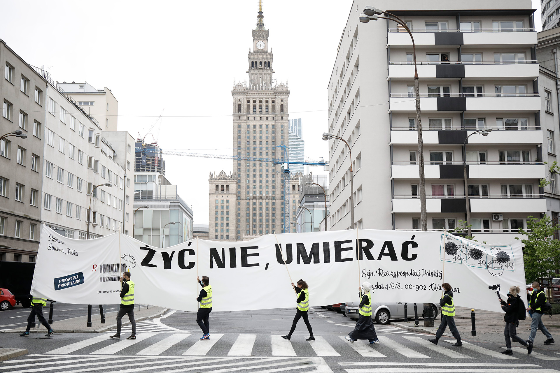
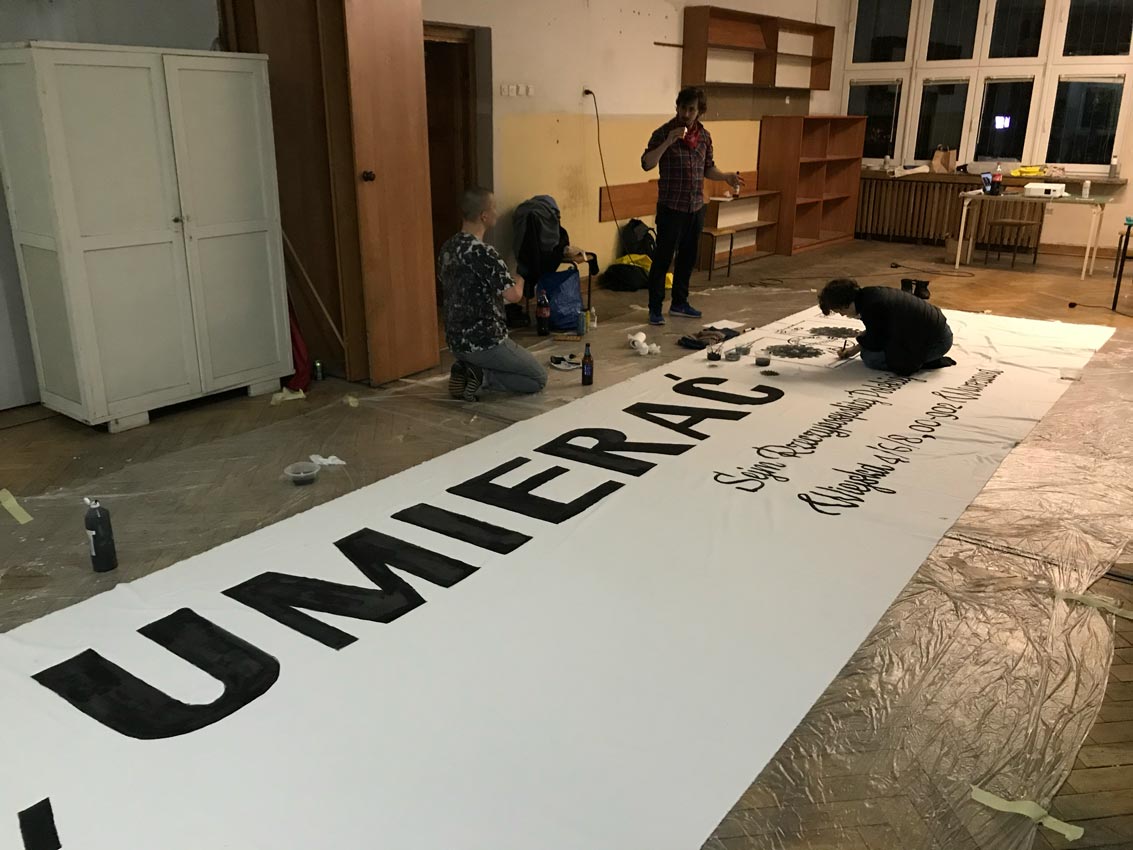
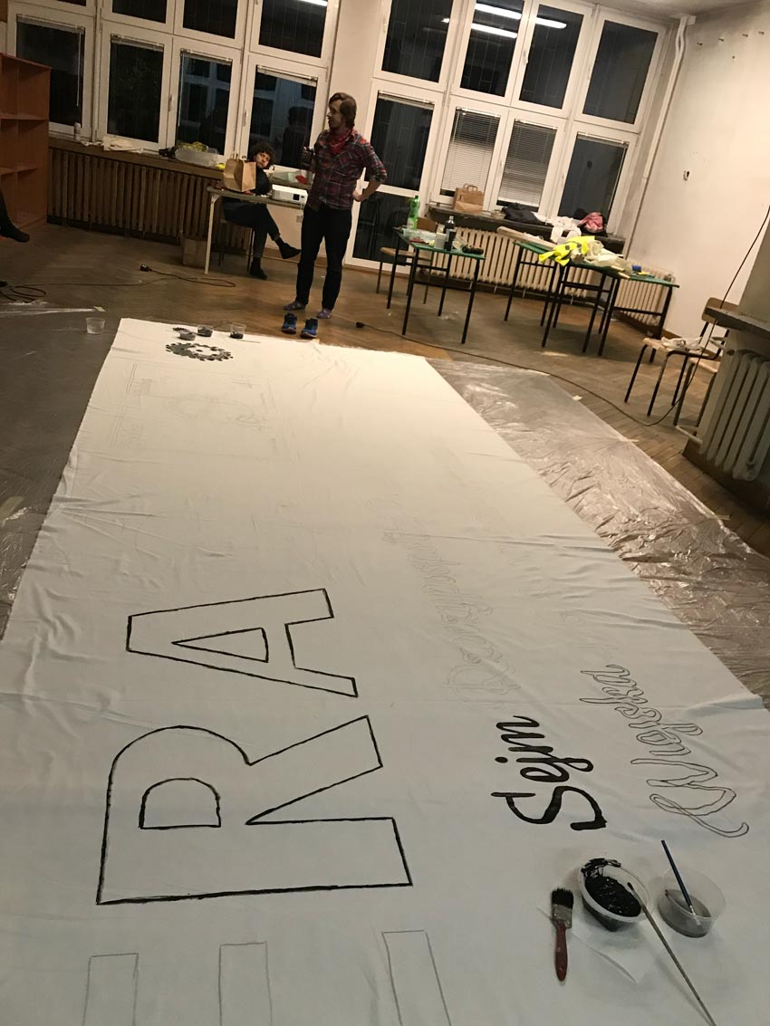
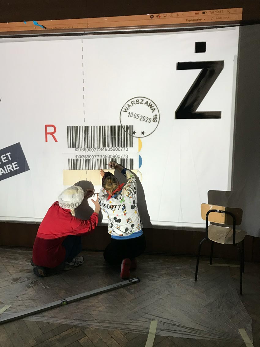
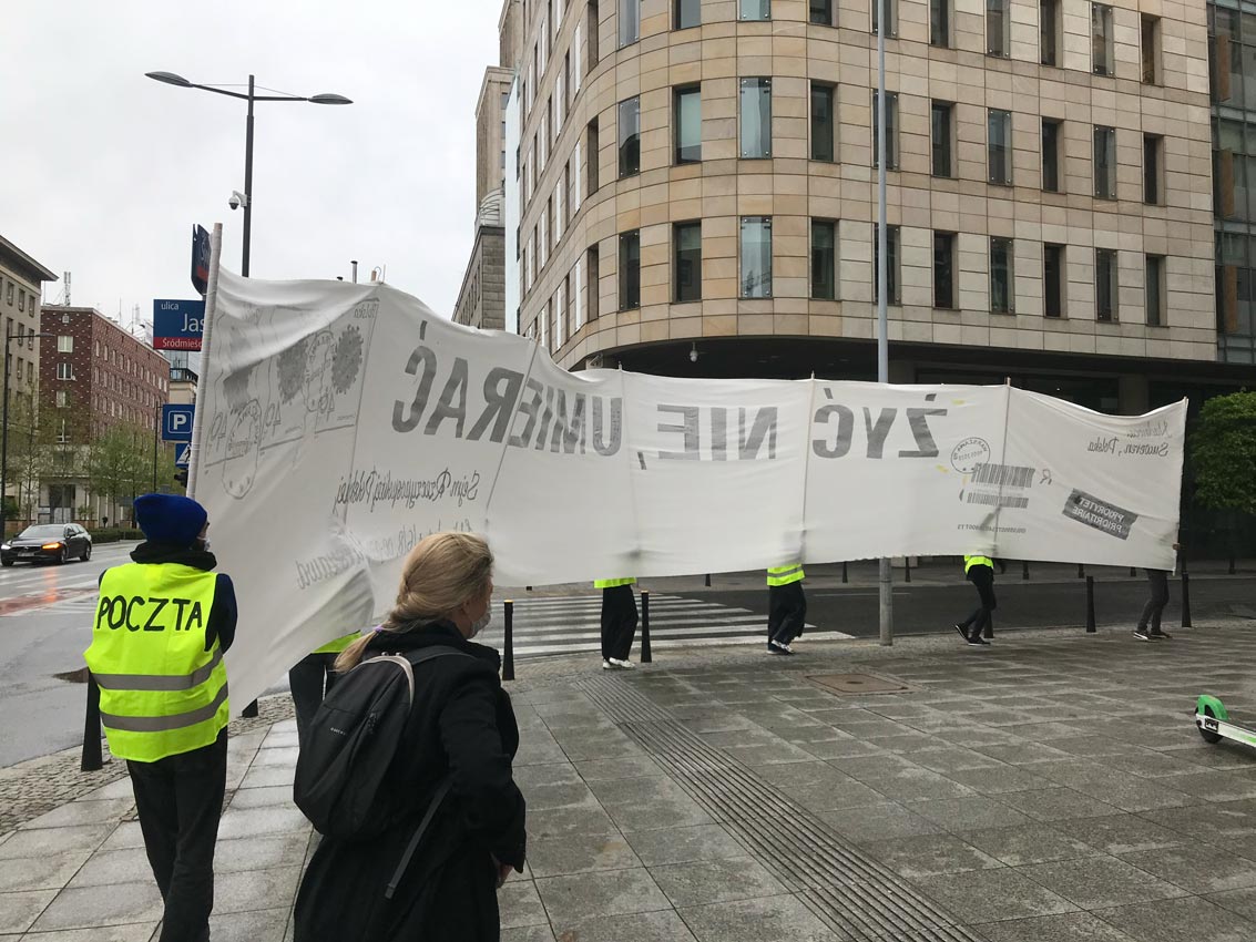
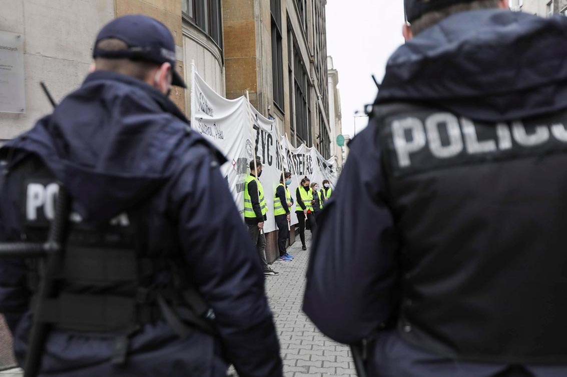
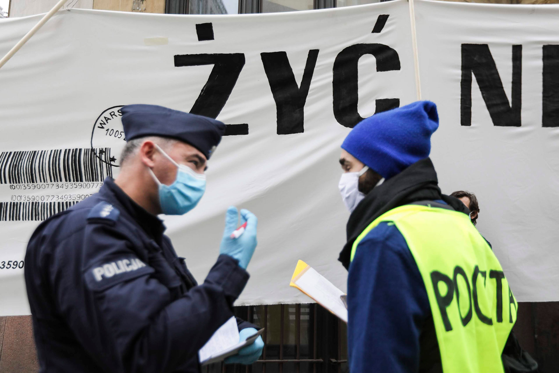
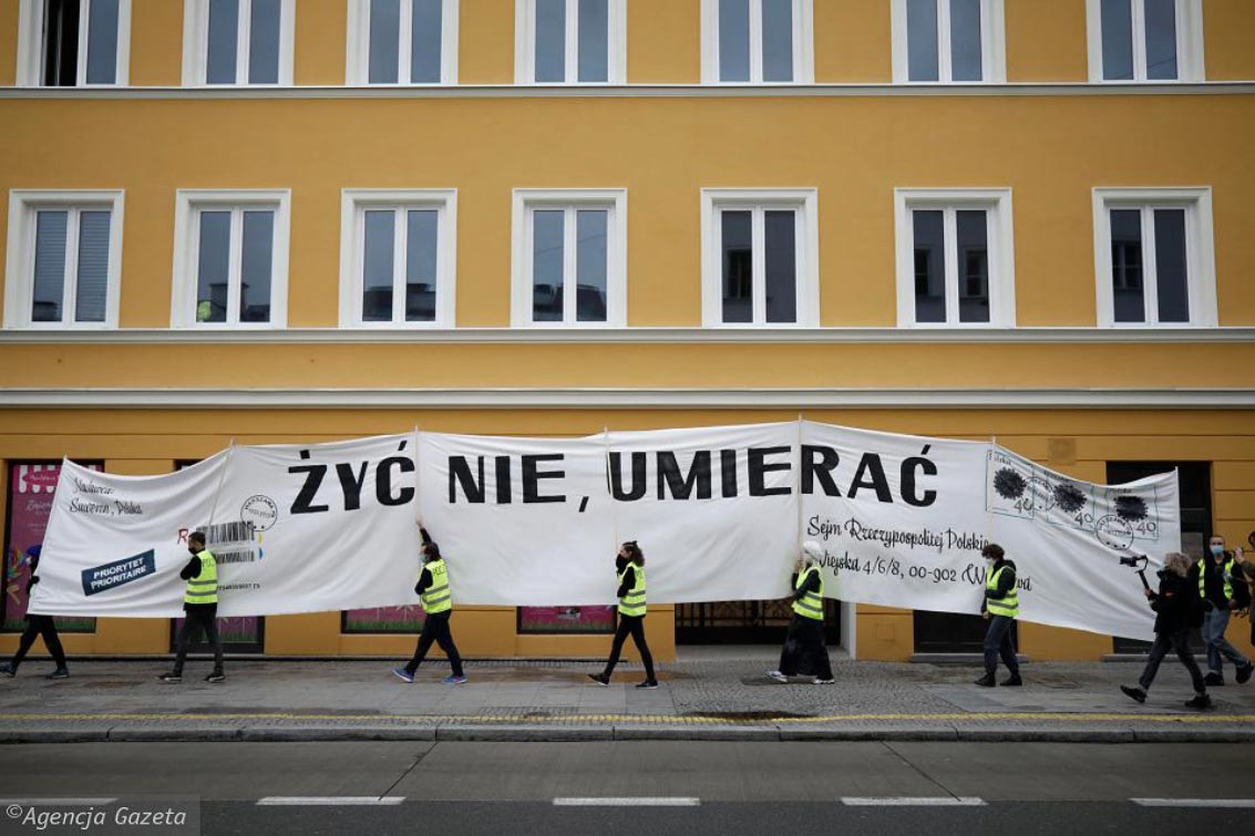
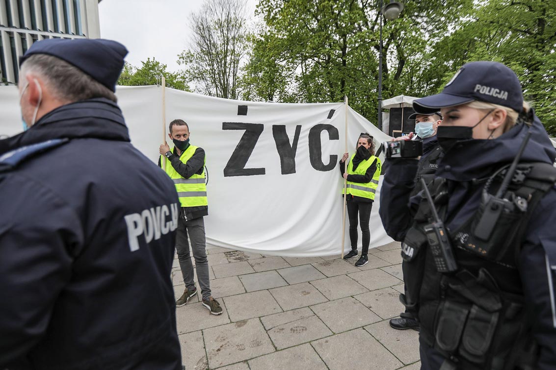
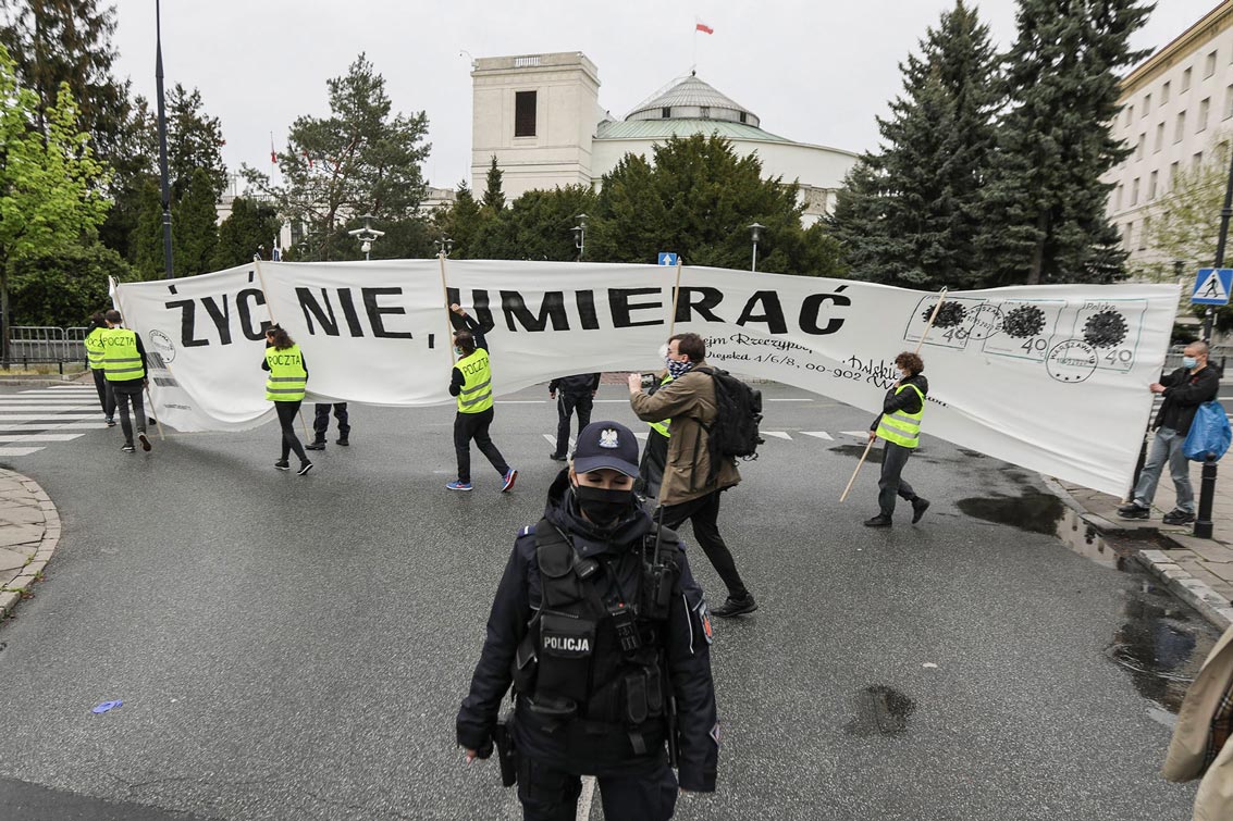
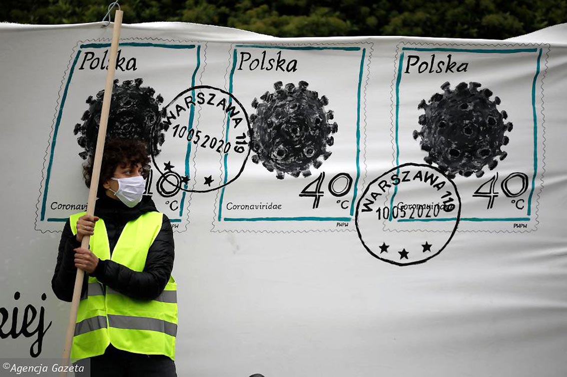
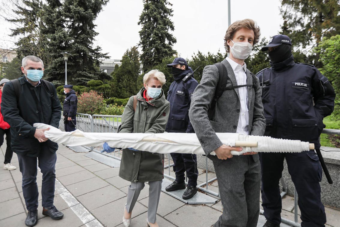
Jury’s verdict: The artistic action ‘Letter’ which was a criticism of the elections which, in the end, didn’t take place, referring to Tadeusz Kantor’s happening, became one of the activators of street protests. Not in a simple cause-and-effect dimension, but as a symbol that one should express her/his opposition even in these difficult times of the pandemic. The action itself, visually and substantially impeccable, was widely commented in the media, and all activities related to the physical objects remaining from the event – we have such an impression – increased awareness of what the protest is and what its consequences are. The jury appreciates the form – including the visual – of this intelligent manifestation of views, as well as the high culture of the dialogue with the authorities, despite the extremely unfavourable conditions.
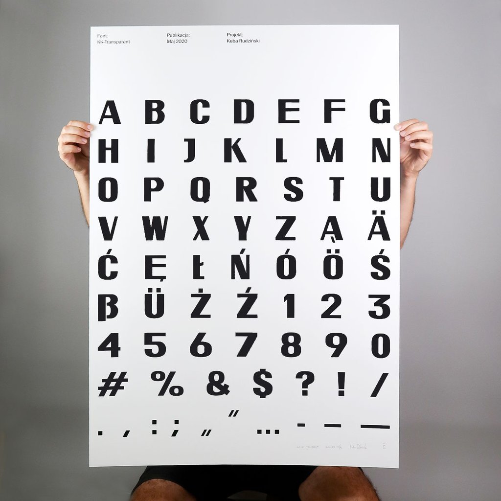
The Transparent font is made available free of charge for other artists and activists who wish to use it in their works, at protests and in civil disobedience actions.
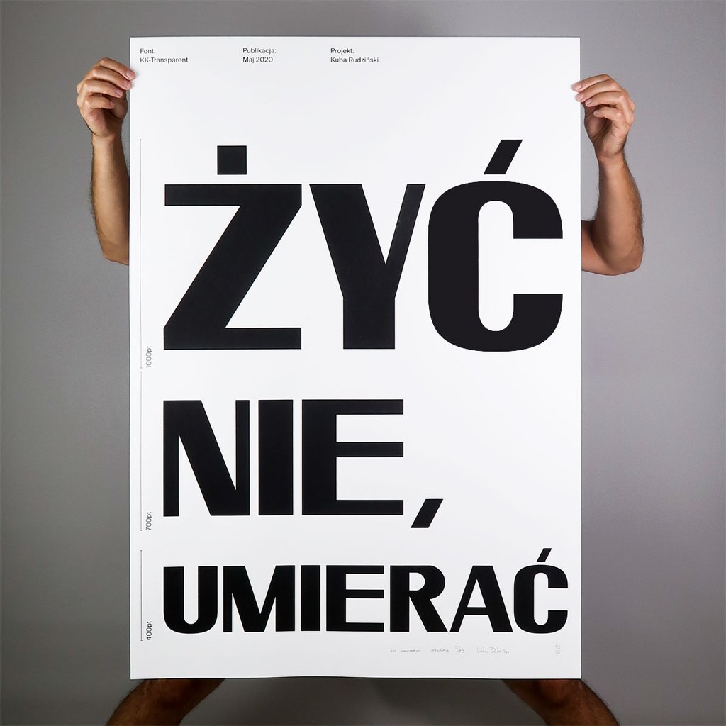
Transparent is a sans-serif, display typeface with modest contrast. It is broad, dense, technical in character, it derives from the lettering used on street signs, the structure is based on geometry. It was designed to be visible and legible from a distance. The typeface has no decorative details, thanks to which it is easy to apply on any surface with the use of basic tools. The typeface has a set of capital letters, figures, a set of Polish and German diacritics, basic currency symbols. All characters have the same height.
In 2020, Transparent was awarded in the Design of the Year competition organised by STGU (Association of professional polish graphic designers) in the “Social Impact” category.
File format: ttf

