
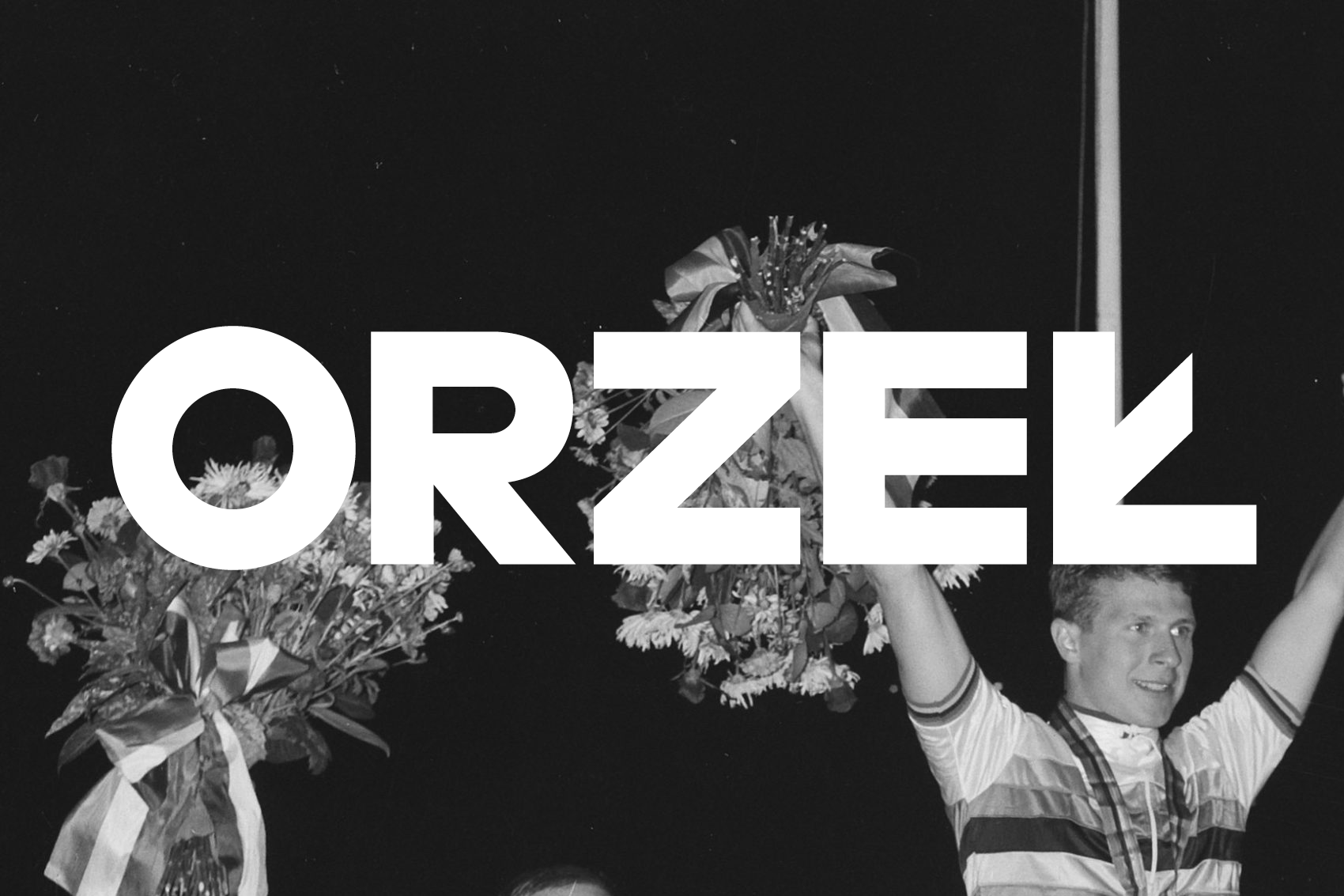
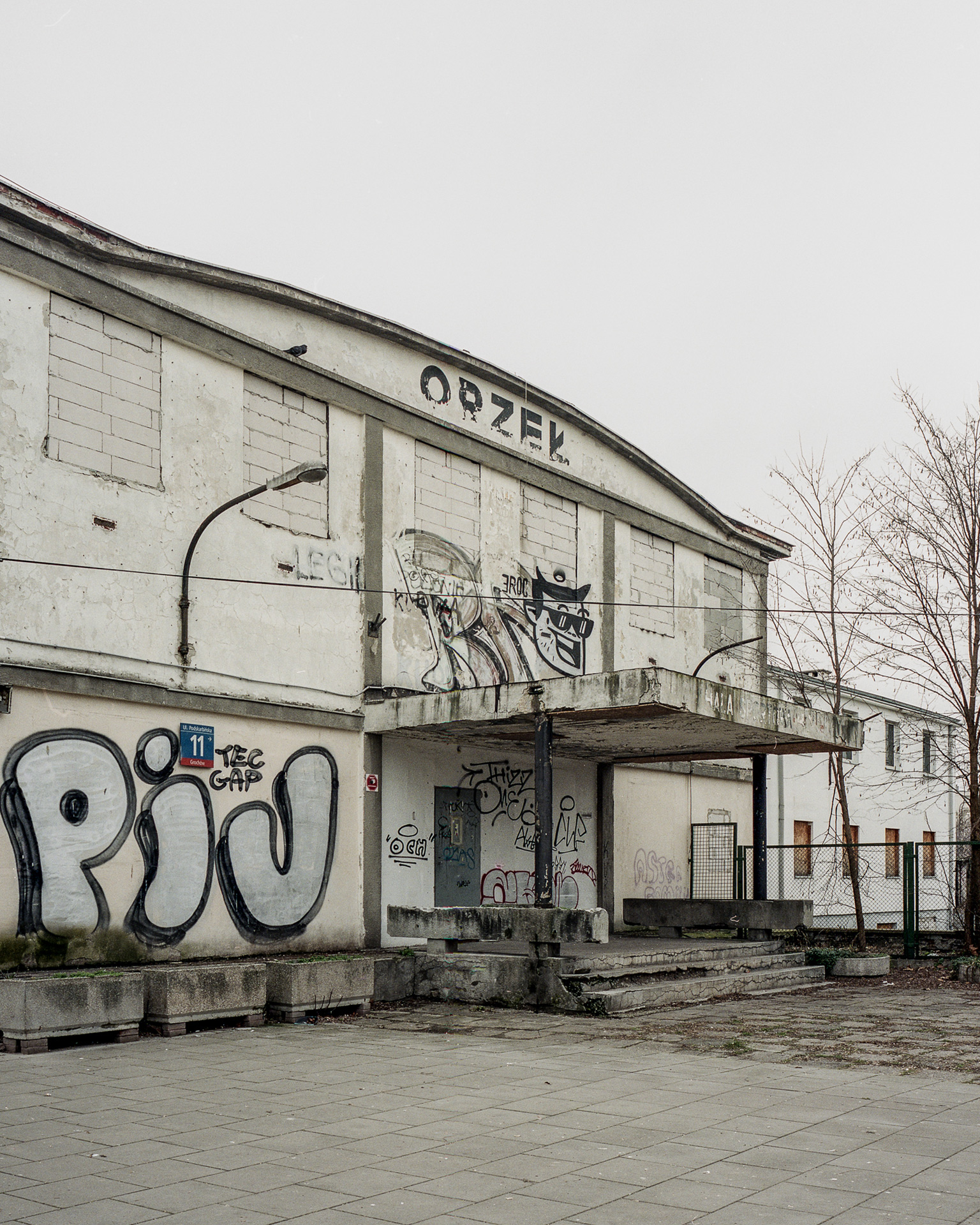
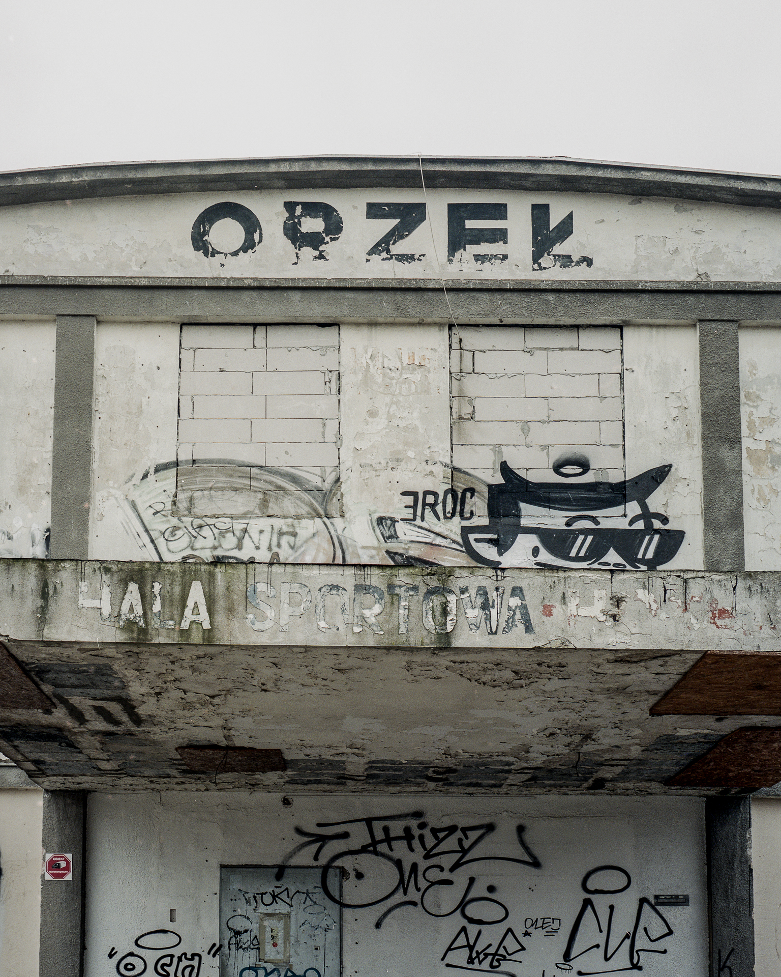
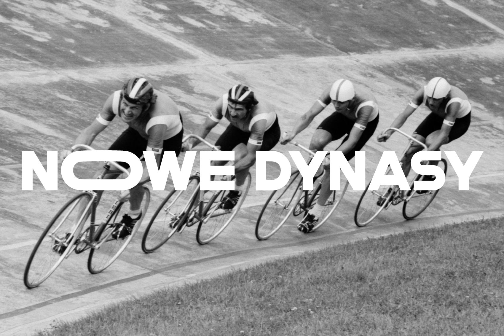
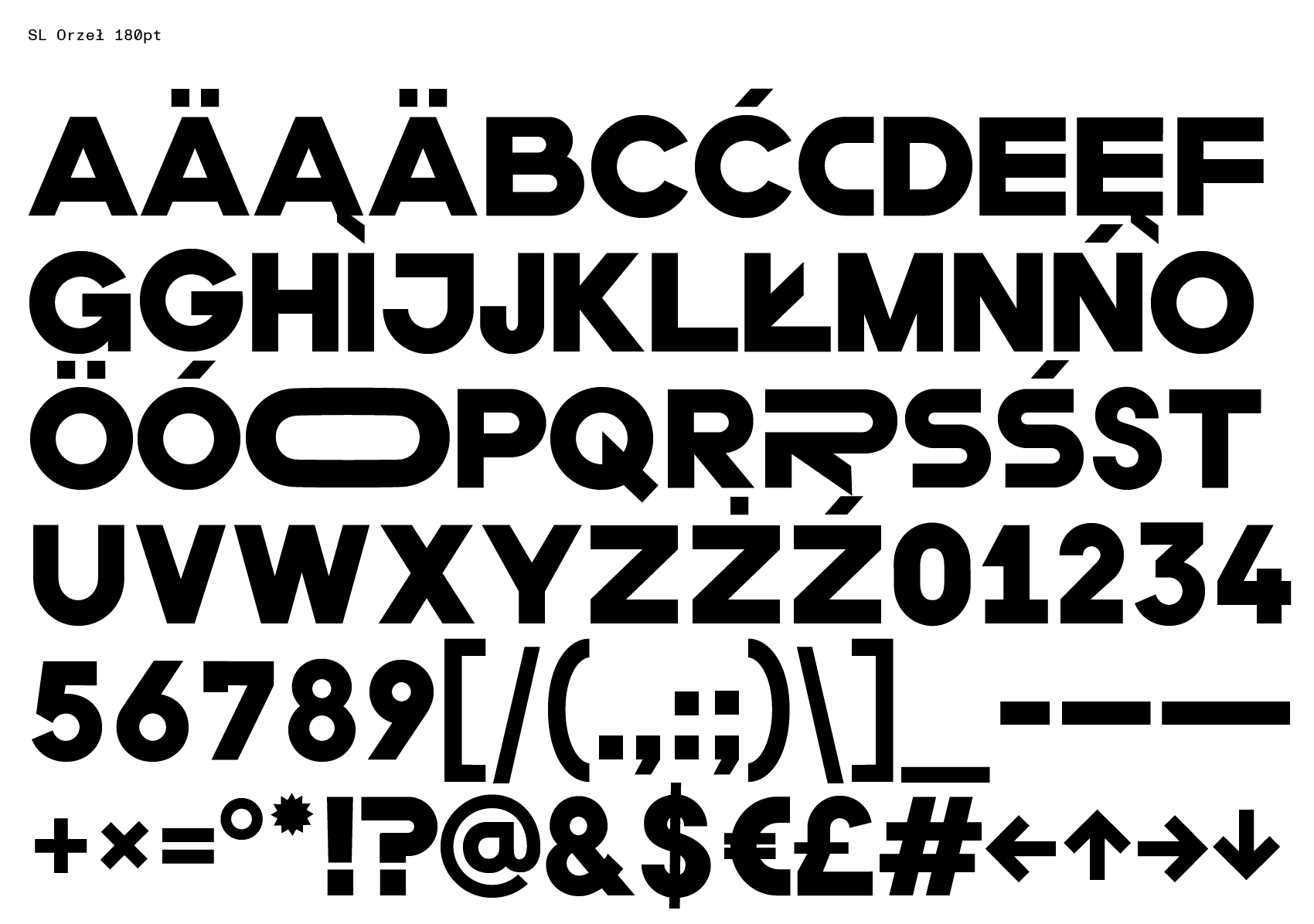
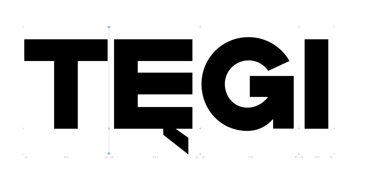
The starting point for the typeface “Orzeł” is the letters found on the building of the RKS “Orzeł” Workers’ Sports Club at the historic, defunct Nowe Dynasy cycling track in Warsaw. The typeface is mechanically built, has a set of letters, numbers, punctuation marks and Polish, English and German diacritical marks.
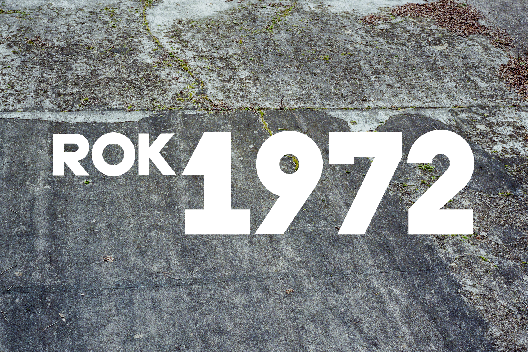
The sports club building was built in 1938 by the eminent (then still emerging) Polish architect Maciej Nowicki. I based the design and proportions of this mono-linear letters on the elements of circle and line adding slight optical correction. The typeface is wide, dense, thick, intended primarily for typesetting titles and headlines. It is suitable for tight typesetting with small lining. The design is inspired by the sans serif typefaces (grotesks) of the Neue Typographie from the early 20th century, the first time when grotesks were first popularised on such a large scale, especially for advertising and signage.
Photo credits:
Archival photo #1: author unknown, in the photo Waclaw Latocha, 1967
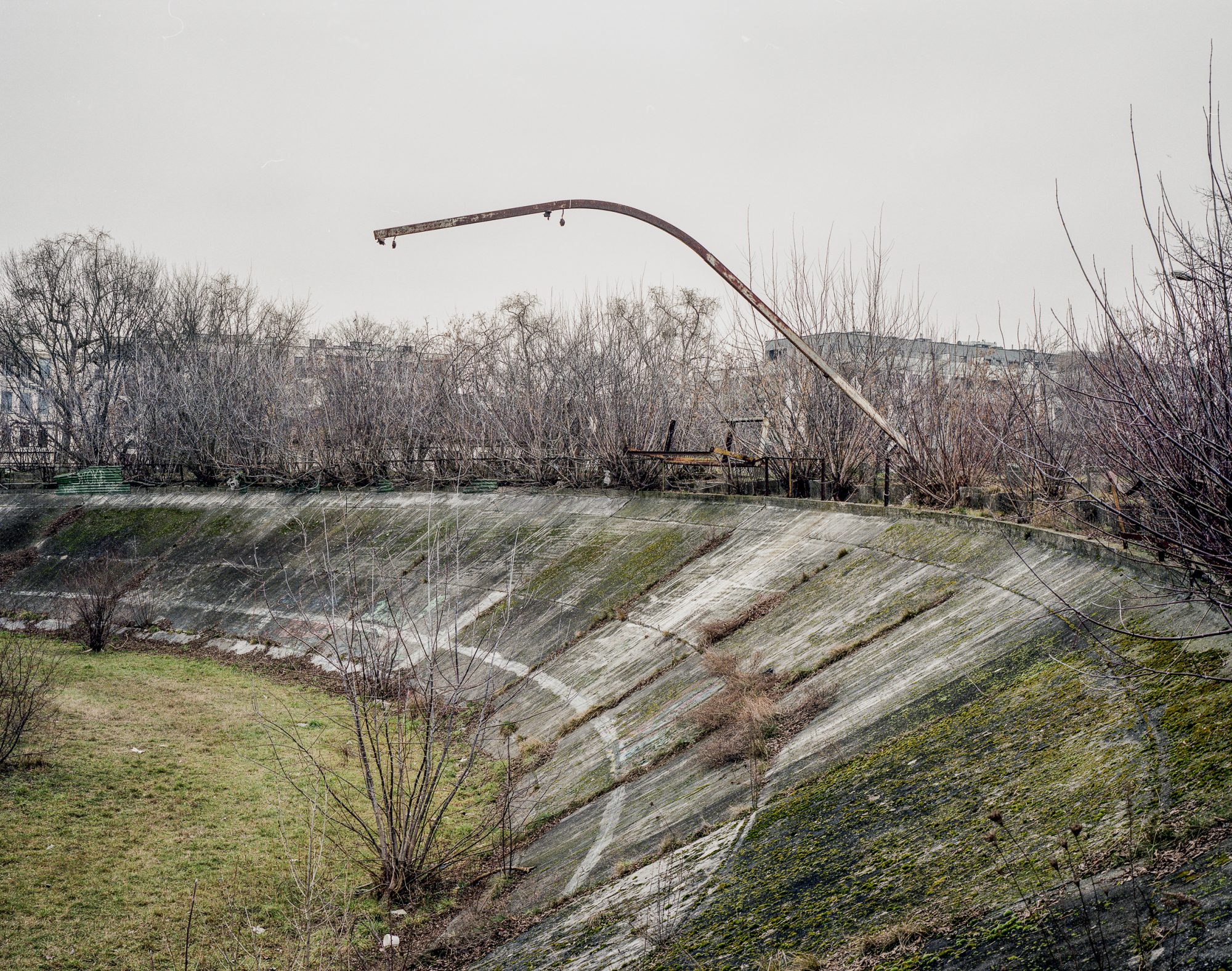
Photographic documentation of the club and the track: Paweł Starzec
Archival photo #4: Jan Rozmarynowski, in the photo Legia riders, 1. Z. Szczepkowski, 2. L. Michalak
The project of the typeface was realised within the framework of an artistic scholarship from the City of Warsaw and the font is available free of charge.

SL Orzeł font file can be downloaded under this download link.